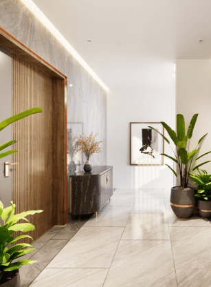
Project Overview
The Commercial Project aims to create a versatile commercial space that accommodates 35 people, including 30 workstations, 5 senior management offices, a conference room, a reception lounge, and a rooftop canteen. Additionally, the project will feature a fountain, a garden, and approximately 6-7 parking spaces.
Objective
The design concept centers around an exposed steel structure and concrete, offering a modern and industrial aesthetic.
Design Inspiration
The design draws inspiration from climatic considerations, emphasizing openness, an inviting atmosphere, and a carefully chosen color palette.
Site Orientation
The site is strategically positioned with an east-west facing direction. The longer sides of the site face north and south, optimizing exposure to sunlight and minimizing the impact of shadows.
Micro Climate Analysis
Considering the micro-climate of the site, the south, west, and north sides are shielded by 7/8 storied buildings, resulting in consistent shadows over the south and west areas. Exploiting the eastern exposure, particularly the southeast, becomes an advantageous design choice.
Building Orientation
To capitalize on natural ventilation and lighting, the building orientations are thoughtfully planned to face north-south. This ensures a harmonious blend of sustainability and comfort. The building's staggered shape is meticulously designed to harness the southeast breeze effectively.


"The Electro team thoroughly enjoyed the partnership and collaboration with the BASIC team. From the beginning they felt like an extension of our team and trusted partners. They quickly absorbed all of the onboarding documentation, asked smart questions, and felt like they were right up to speed with the rest of us in no time."
– Brock Weaver
Group Project Manager

Relationship
– Spectrum is a website redesign project that aimed to elevate the user experience and improve brand identity for a tech company. Our team worked closely with the client to understand their target audience, brand values, and business goals in order to create a modern and visually appealing design that would capture the attention of potential customers.


Content Strategy
– The delicate balance between purpose and product truly came to life throughout our overall content strategy for this redesign. We set out to create a central system that could not only serve as a shopping platform, but a brand initiative as well. In doing so, we were able to weave Patagonia’s passion and purpose right into each product story, and keep consumers engaged in the brand, even if they were just looking to shop.


Intersecting strategy with design
Through in-depth strategic discovery and integrating our findings into the design process, BLVR told the story of who Rushing really was. We conveyed the most authentic brand elements to clearly represent Rushing in each design feature possible. By entirely recreating their logo and establishing a fresh color palette, we brought new energy into Rushing. We laced their passionate strategy into every avenue of the elevated brand identity to reestablish Rushing as the truest version that they could be.


